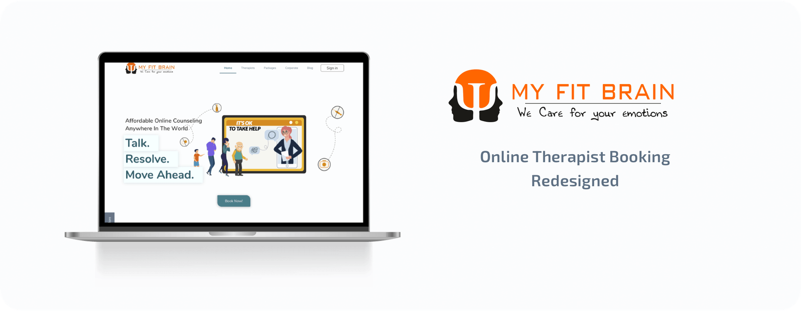
My Fit Brain - Emotional Health Redesigned
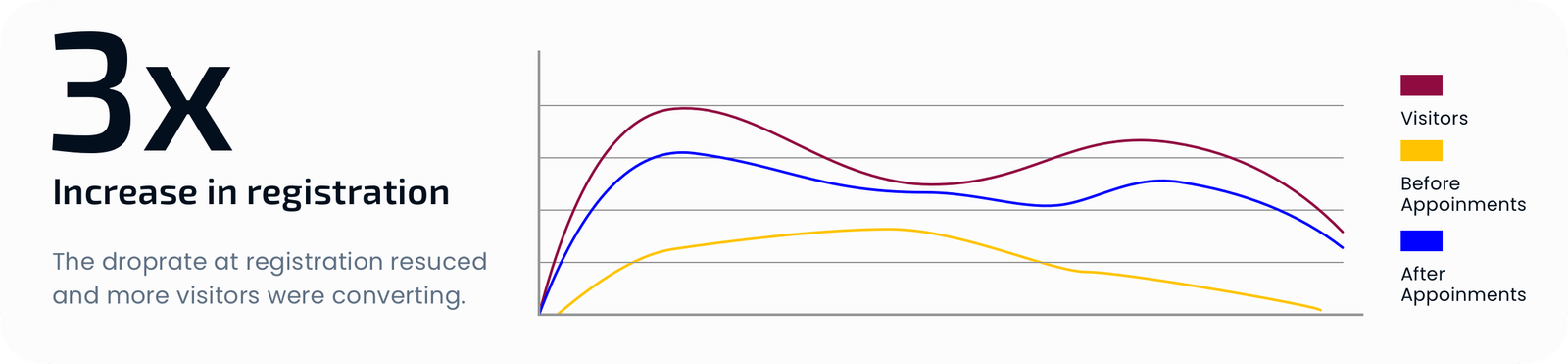
One of the top online Therapist platforms suffered from a high exit rate. Upon conducting UX Research I found out that users were having issues in the registration process. Once I delivered the reworked screens the analytics showed a 300% increase in a successful registration.
Brief
The client wanted the website redesigned and make the colour palate fit the industry. They needed to figure out why there is not as many registrations as expected.
Role
User Experience and Interface Designer
Tools
Sketch, Figma, Zeplin, Miro, Affinity Designer
Timeline
2 Months
Problem Statment
Business Goals
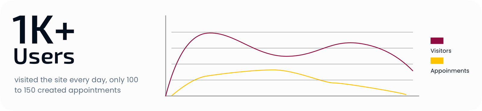
The client wanted the website redesigned and make the colour palate fit the industry. The biggest problem faced was the number of visitors was not adding up to the number of successful signups. They also wanted to improve the UX of the website as they were worried about the user flow and wanted to increase the index ranking in google.
User Needs
Users wanted easy & trusted ways to book an online consultation session with the therapist and be able to address the exact issue they are having.
Process
Research
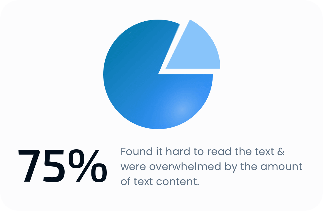
This stage was particularly hard due to the sensitive nature of the service. As an initial step, I conducted an interview & usability study with 8 participants. I gave tasks to participants and observed them trying to complete the task, after which I looked to the site analytic which combined with the usability study helped to identify that users had problems with.

Empathy Map & Persona
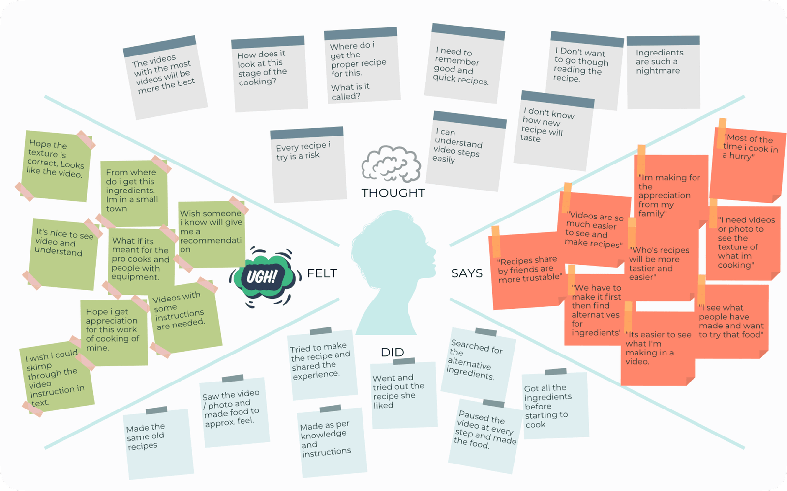
To empathise with the users & keep track of their needs personas was made using the data from the research.

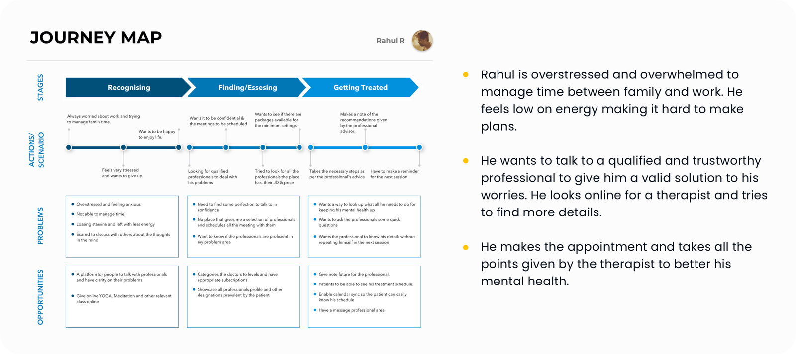
Journey Map
User journey maps were created based on scenarios defined for the personas.
Ideation
Analysing the research data brought more insights into what users wanted.

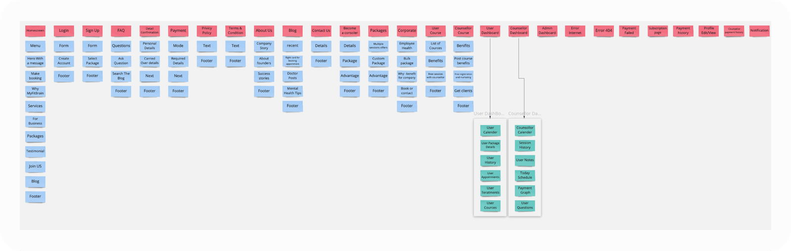
Information Architecture
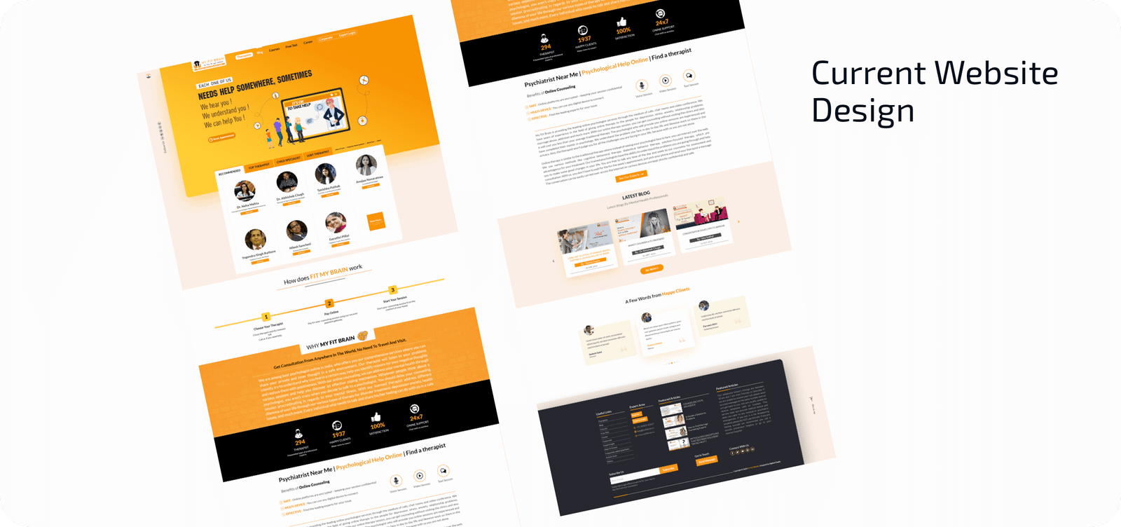
1. The existing colour of the website was not WCAG compliant. New colour options were suggested as it was one of the requirements.
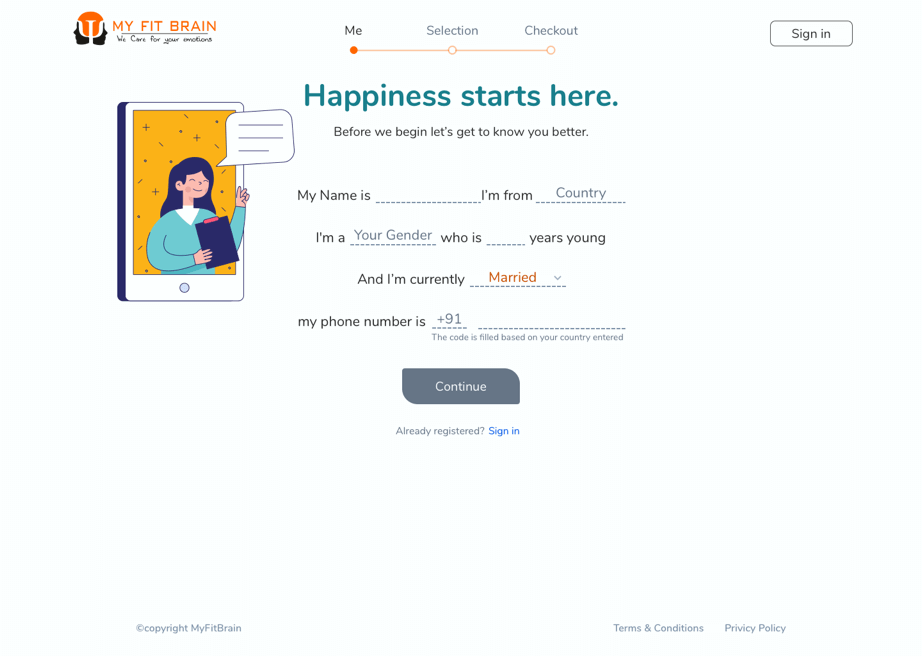
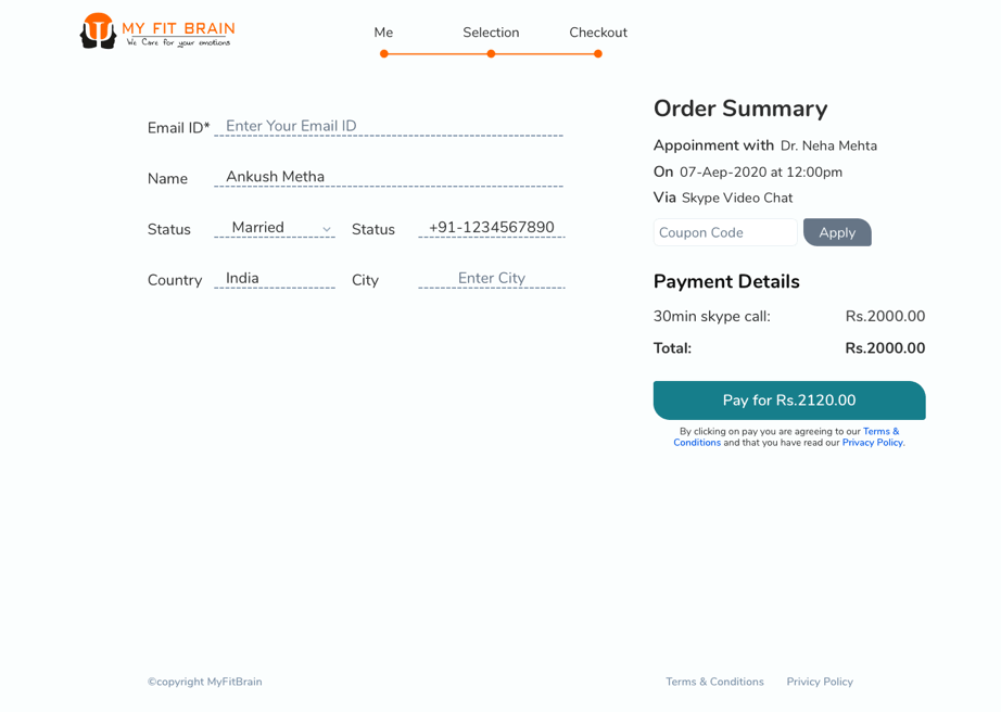
2. A conversation-based registration form, made the user feel connected instantly making it easier to fill. The form was split to reduce duplicate entries and information overload.
3. Package and corporate packages.
Apart from all this, a general solution was to show some real numbers, explain the process upfront and other improvements.
Proposed Solution
Based on all the findings and empathising with users, I came up with the solutions to address the business & user needs. Most of which the client approved after some persuasion and explaining what they are important. Some of the solutions were moved to the next version.
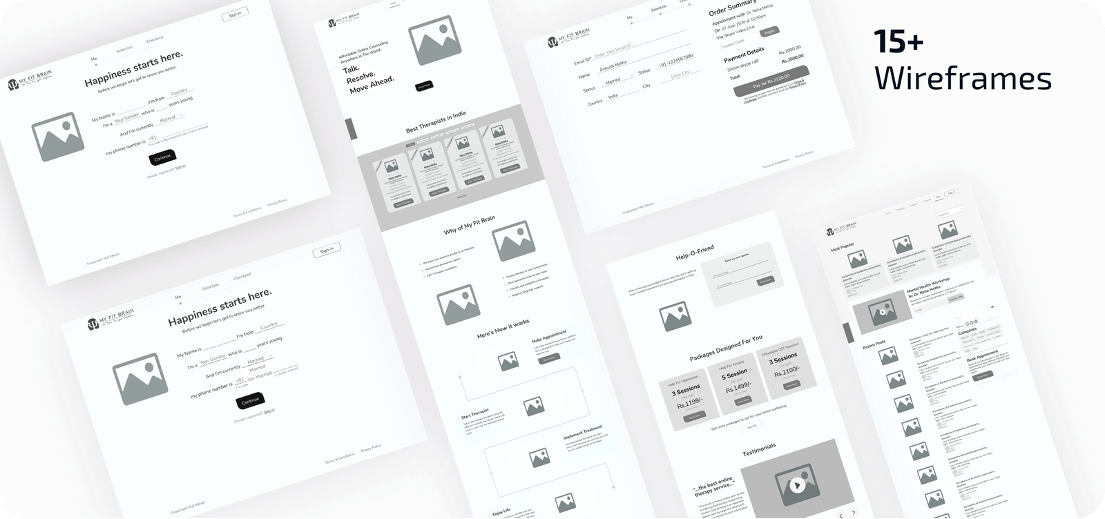
Wireframe & Low-Fi design
The initial wireframe needed some improvement's and the client wanted some features added. After creating a few iterations of the wireframe I created the Low-Fi design, using which I conducted a user test.
After the user test, the registration process still needed some improvements. Users were overwhelmed by the number of items in the form. The solution was to split the registration into respective steps.
Visual Design
The visual design was made after taking the client through the app flow and conducting usability testing. Based on the findings and feedback there were some changes made after which the visual design was created.
Documentation

This was done for all the screens where the feature has to be explained so that the developers and client had a clear understanding of the design deceptions.
The visual design was made after taking the client through the app flow and conducting usability testing. Based on the findings and feedback there were some changes made after which the visual design was created.
Results
After the website was developed the business saw a 3x increase in the users registering. Conducting small feedback from the existing users including the therapist was positive and wanted to see the change in their dashboard.
Takeaway
The usability testing was a challenge as the project was during pandemic times and it was important to see how people will react to the registration flow in this situation I had to make the participants join using two devices one for sharing their screen and the other to share the face to see the reaction. This method helped in other projects and like a fine wine I kept getting better using this method.
Next Steps
Optimisation for responsive design as the initial project was for desktop focus only.
The therapist dashboard needed a redesign to make it more efficient and easy to go over tasks, appointments, create blog posts etc.
WOW!!! You made it to the end.
Thank you for your time.
Have a look at the therapist dashboard case study.
It’s a quick over view